Irony Works
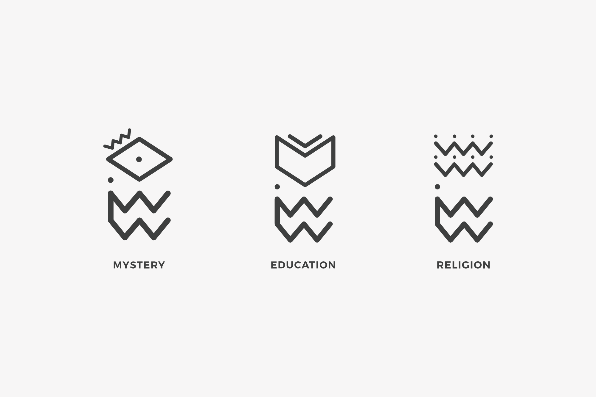
Irony Works is a publishing firm generated from a random selection of terms. For this project I was given a rhetorical device, irony, and three words to create supplementary imprints for the firm: Mystery, Education, and Religion. From these words I was challenged to create a brand using the following prompt: We want to come across as exciting and dynamic, but not aggressive. The opposite of irony is wrinkly. The Irony Works Logo is a wrinkle as well as an I and a W. Mystery is an eyeball that represents the truth that is found at the climax or end of a mystery novel. Education is a book and an arrow pointing down the path towards learning. Religion represents a congregation of people as well as a crown. The graphics are black and white to emphasize the opposite nature of irony.