Kudos
Concept, brand identity
Background
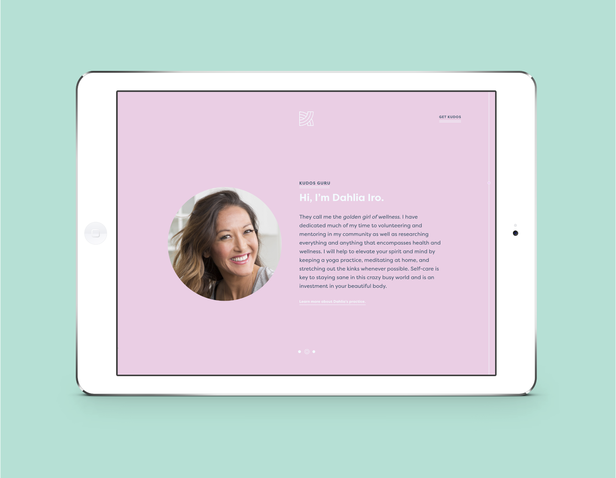
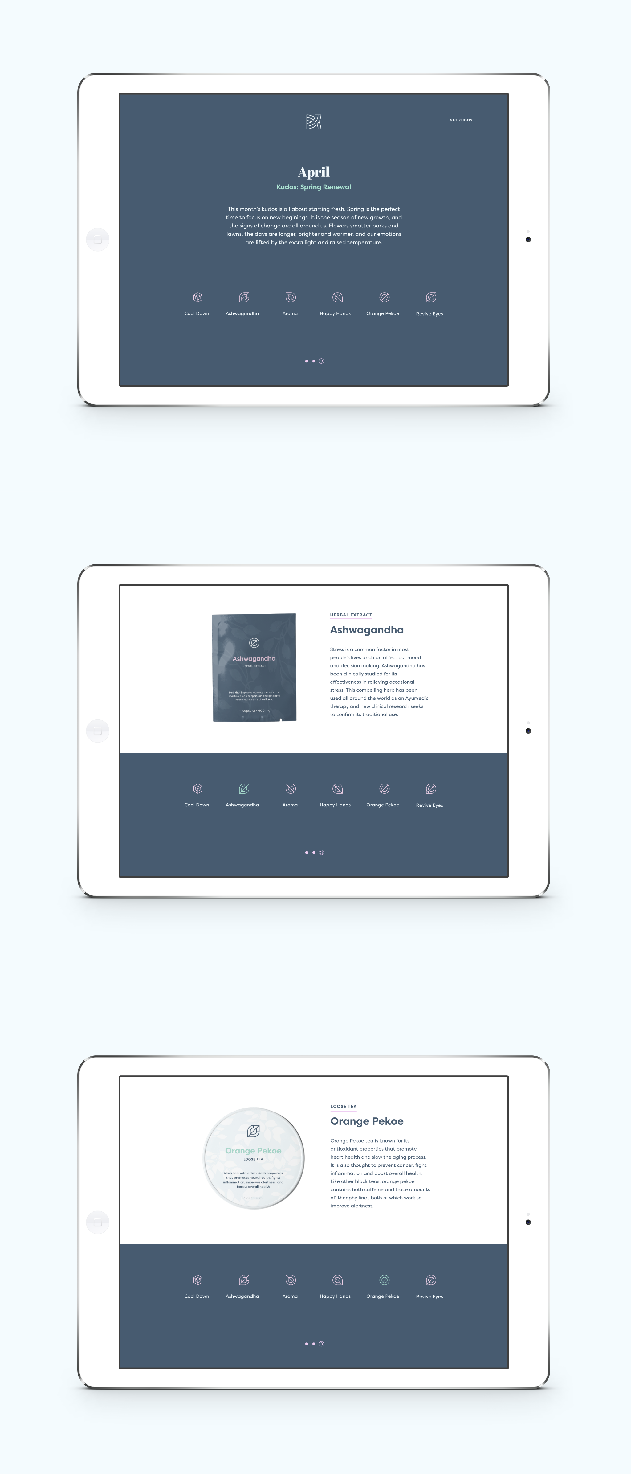
Kudos is a conceptual self-care training service I created for my senior capstone project. The assignment was to build an experience-based brand, and I knew I wanted mine to be mission driven. Kudos was designed to help people relax, destress, and reconnect with themselves through guided practices and monthly curated products chosen by a Kudos Guru. The name comes from the idea of giving praise and honor, a reminder that the care you give to the world should be given back to yourself.
Challenge
The challenge was to build a visual and experiential identity that felt intentional, restorative, and grounded in real wellness principles. It needed to communicate calm and balance without falling into overused self-care tropes. The entire system also had to reflect the idea of wholeness and mindful practice.
Solution
I built the identity around the inspiration of Japanese rock gardens, where raked sand represents gentle ripples in water and supports meditation. This became the foundation of the logo, which uses circular forms to symbolize unity, completeness, and wellness. The same geometry carries through the iconography and pattern system, creating a cohesive, peaceful, and purposeful brand world. The result is a concept that feels both thoughtful and immersive, reflecting the mission of making self-care a guided, accessible experience.


Logo Exploration

Moodboard